“Colors, like features, follow the chain of emotions.” – Pablo Picasso
We may not be able to discern how color affects us, but it’s something that has a profound impact on us every day. Oscar Wilde famously said color can “speak to your soul in a thousand different ways.” Think about it. Loud neons evoke energy, yellows and oranges spark warmth, and greens and blues make us feel calm and at ease.
We all know that in both fashion and design, color trends ebb and flow from year to year. Like the rotation of kaleidoscope, let’s say. And there are certain hands that turn the wheel of this said kaleidoscope. Industry leaders in the color world, like Pantone, predict which colors will be most popular, but interestingly, these trends come from us.
Pantone has said that color “has always been an integral part of how a culture expresses the attitudes and emotions of the times.”
So you see, there’s a psychology to the whole color-trend thing. Trends stem from what’s going on in the world around us – what we, as a society, are gravitating towards. Whether we’re painting our home, shopping for a new shirt or liking photos on Instagram, we’re more drawn to colors that express our present needs as a culture.
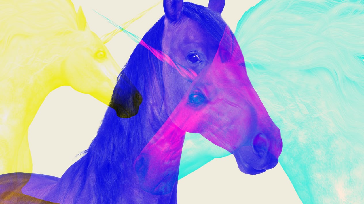
This year, Pantone’s color of choice is UltraViolet. They say this “spiritual, cosmic hue,” prompts us to “look upward and outward to the future.” Think about it. In a world that feels increasingly heavy and divided, we long for carefree hope! Enter, purple.
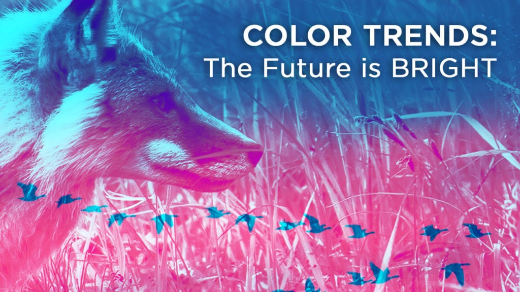
We’ll be seeing lots more neons and zesty, attention-grabbing color schemes too! Actually, our new Website – this bright aqua you see – is one of Pantone’s colors for Spring 2018, so we’re ahead of the curve. We think it feels refreshing and light!
Contrastly, last year, as a result of so much screen time and filtered images, there was a common longing for nature and authenticity in the form of earth tones, green botanicals, and ample white space. We saw plenty of woods, metals, and rock textures, thanks to a sweeping movement towards organic materials, car-sharing and upcycling.
Still, our schedules are overloaded in 2018, calling for minimalism. And, an upsurge in technology lures us to unplug and be present! Our busy minds want sanctuary and respite – something real, honest, and relatable. Something human. So all those pleasant, neutral tones are here to stay (for now, at least).
Hues of sophisticated blush and minimalist pastels aren’t going anywhere either, but due to the rise of feminism, pink is transforming from “soft” into a color of strength. According to Pantone executive director Leatrice Eiseman, “Pink has developed more power than ever before.”
Fascinating how much color depicts our perception of reality! So much so that the strategic use of color in graphic design can easily send a more powerful message than the text itself. It can totally disarm us, in the best of ways, until our spirits illuminate with the vivacity of red, the serenity of blue, and the energetic depth of purple. Get ready, 2018. The most evocative pops of color are pivoting their way into your kaleidoscope!