
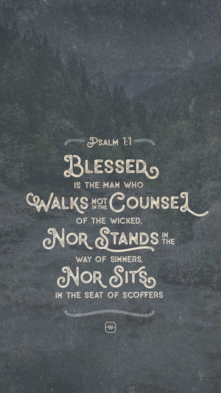
We live in a world full of images.
“Digital Marketing experts estimate that most Americans are exposed to around 4,000 to 10,000 advertisements each day.” That includes images, radio announcements, pop-up ads, direct emails, etc, and that statistic was written in 2015.
In 2016, the New York Times published an article on the update attention span of the average adult in the United States: 8 seconds.
You have 8 seconds to get a message across, while you compete with let’s say 6,000 images that person might see in that day.Wow!
That means that churches have to stand out in that crowd of images or they are obliterated. As I write this, I was instructed, no we’re not writing this to get your business (if we do that would be a bonus) but mostly to let you know: you are competing with massive brands like Apple or the Super Bowl to get the attention of a person, to spread the gospel. That’s why churches began right: to share the good news.
So ask yourself or your team:
- Are we current with the way people communicate these days?
- Are we communicating our message with great design that could stand out in the crowd (after all, the gospel is something that should bring joy to people)?
Making a flyer in Microsoft Word doesn’t cut it anymore
You might be thinking: we’re a church with a small budget, we can’t afford to have new & fancy designs each week, or we got lazy this week and didn’t send the design in on time. Let me state this again. No, design isn’t everything. However, you are living in a century of social media where images are easier to share than text and people have an attention span of 8 seconds. Time to make your mark.
Heres’ 3 brief case studies & action steps:
How do you stand out? What’s the standard?
Let’s look at some megachurches or organizations that set a “standard” or have been proactive with creating amazing design that is current with that time period. You have to remember, creativity changes with time (as an artist, I’m not expecting to create the exact same things 20 years from now, I’m not expecting to make the same things 2-3 years from now).
1. Hillsong
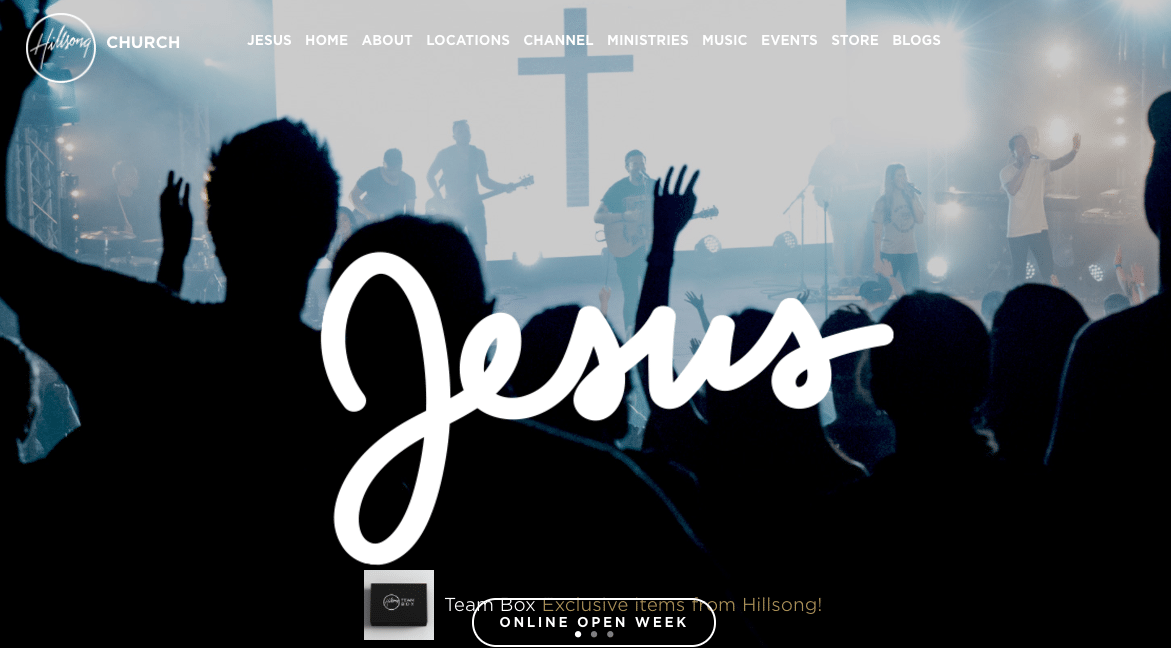
You know their music, I’ve personally been listening to their album Of Dirt & Grace for quite some time. They have a worldwide movement and have churches all over the world, each relating to their culture. I went to Hillsong London last October and the images on their website matched what they are saying and doing at church.
They are creating with excellence.
Today I’m focusing on the main Hillsong website. It’s clean in terms of design (no fancy scripts, lots of photography of people, simple and direct in terms of written messages. Here are a couple of images so you can see for yourself. There messaging is direct, their images are clean and the website is very user friendly.
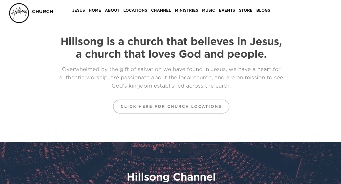
As I mentioned, they have several campuses around the world, and their websites maintain the same color schemes, the same type of messaging, they just adjust it to meet the age groups that attend their different campuses.
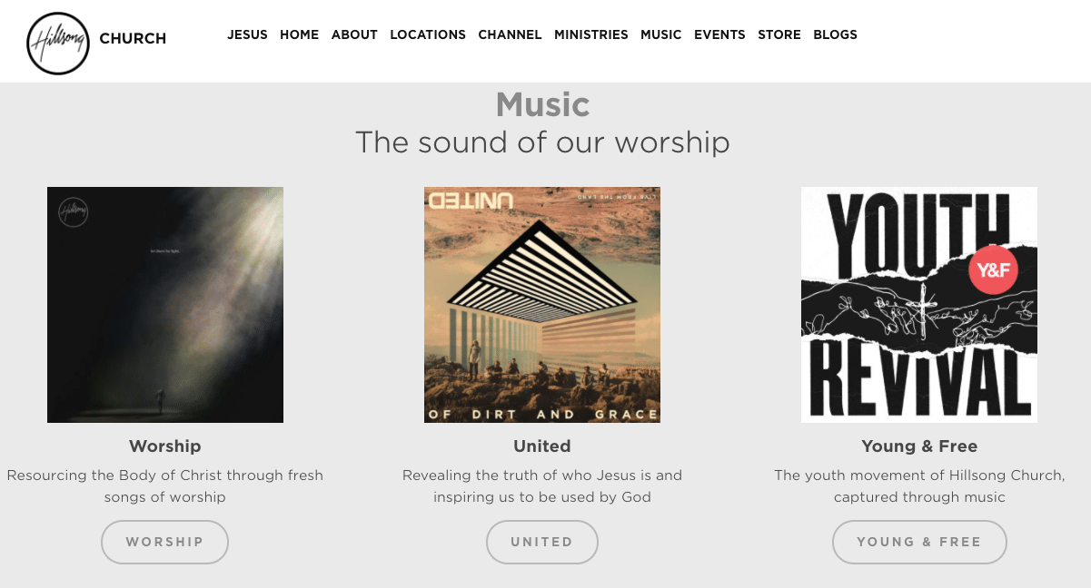
On Music: They’ve created amazing music throughout the years and as such, their music has to be accompanied by great art. For instance, I love the design work for Hillsong’s recent album United. They used clean & bold marks for stripes with black & white photography.
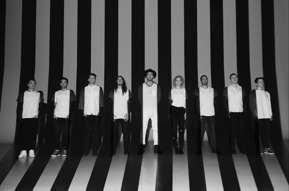
**All images taken from Hillsong.com**
2. Watermark Dallas
Watermark is a mega-church in the Dallas/Ft. Worth area. I know they make great design because at one point they hired one of my very talented friends when she was fresh out from college. For the sake of this blog, I’ll just focus on one of their designs.
As I browsed through their website, I noticed they had a challenge where people could go memorize scripture. How did they do that? They created screensavers for smartphones & tablets so people could place them somewhere they could see them daily.
In 2015 Time Magazine share that Americans look at their phones 46 times a day, which was up from 33 times in 2014. So that would mean in 2017, people are going to be looking at their phones around 72 times per day!
Watermark knows where to place their messaging. They are sending it directly to people’s phones, the place that they looked at the most in the day.
They designed a series with a very rustic font that looks handwritten as is popular in design today. They even had 2 options of the same design, because they are aware some people within their body might not be attracted to that design.
Here’s some of those designs, for you to look at (no we are not saying that handwritten, rustic fonts are everything you should do, remember your audience might be attracted to something else…)
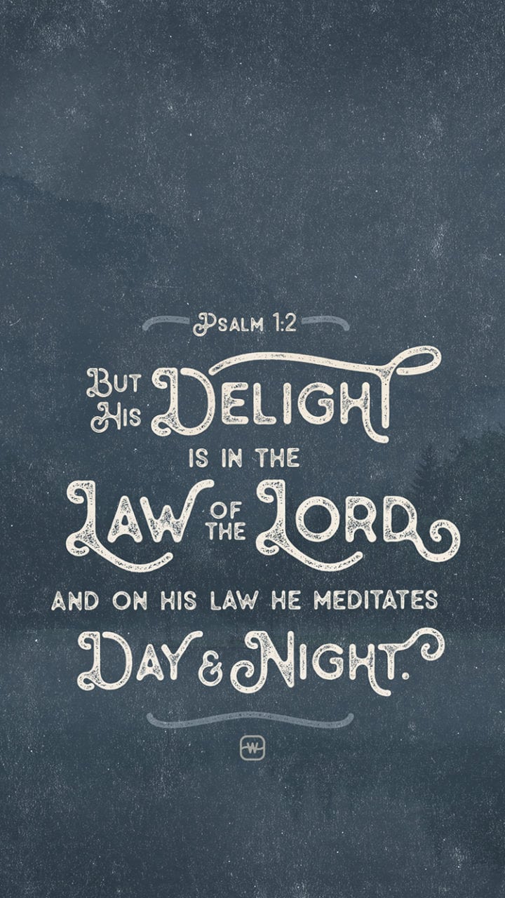
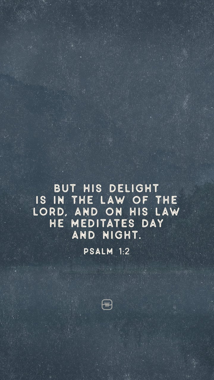
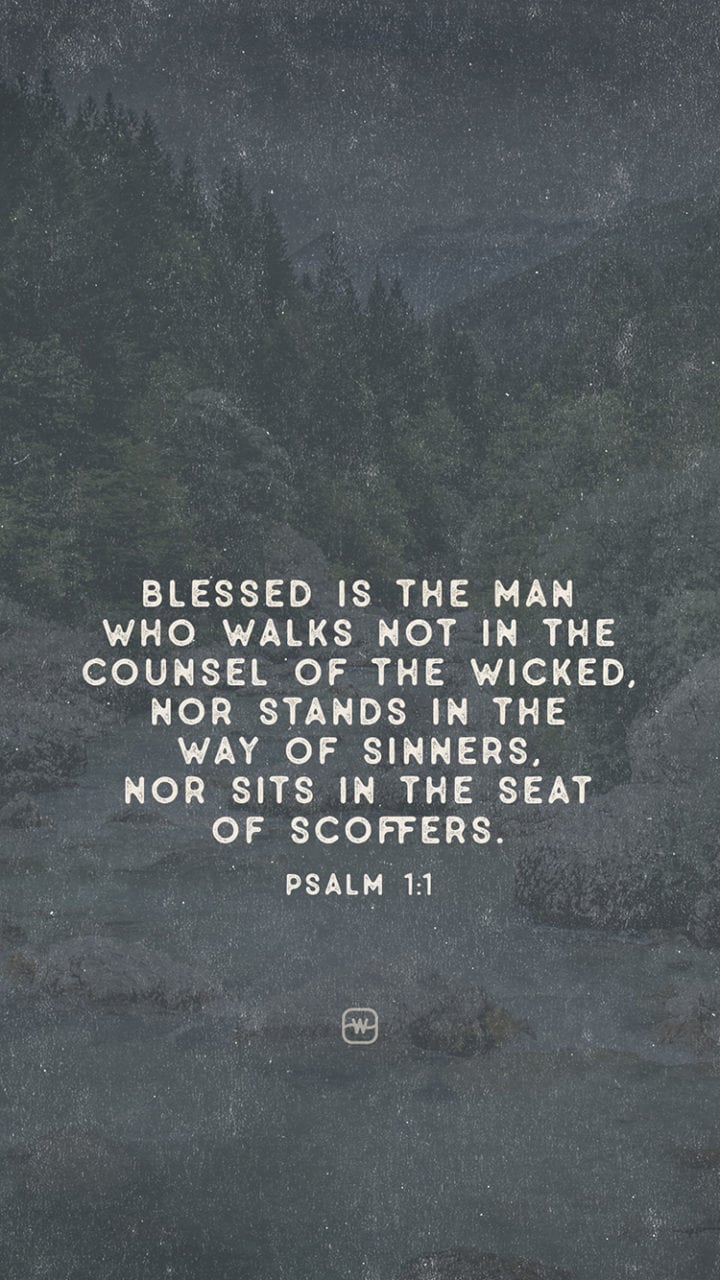
Images from Watermark Church Website: http://www.watermark.org/blog/six-week-challenge
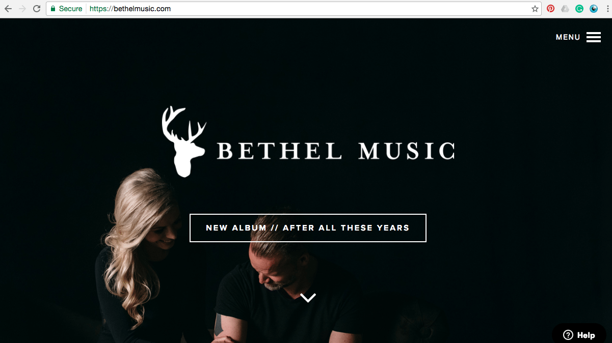
3. Bethel Music
Bethel Music is a part of Bethel Church in Redding California. Type in: bethelmusic.com.
You’ll find the newest album by Brian & Jenn Johnson (which is awesome if you haven’t heard it).
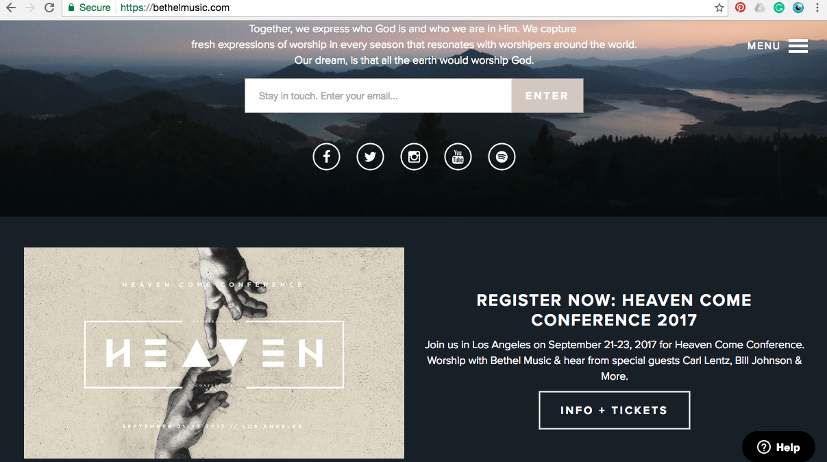
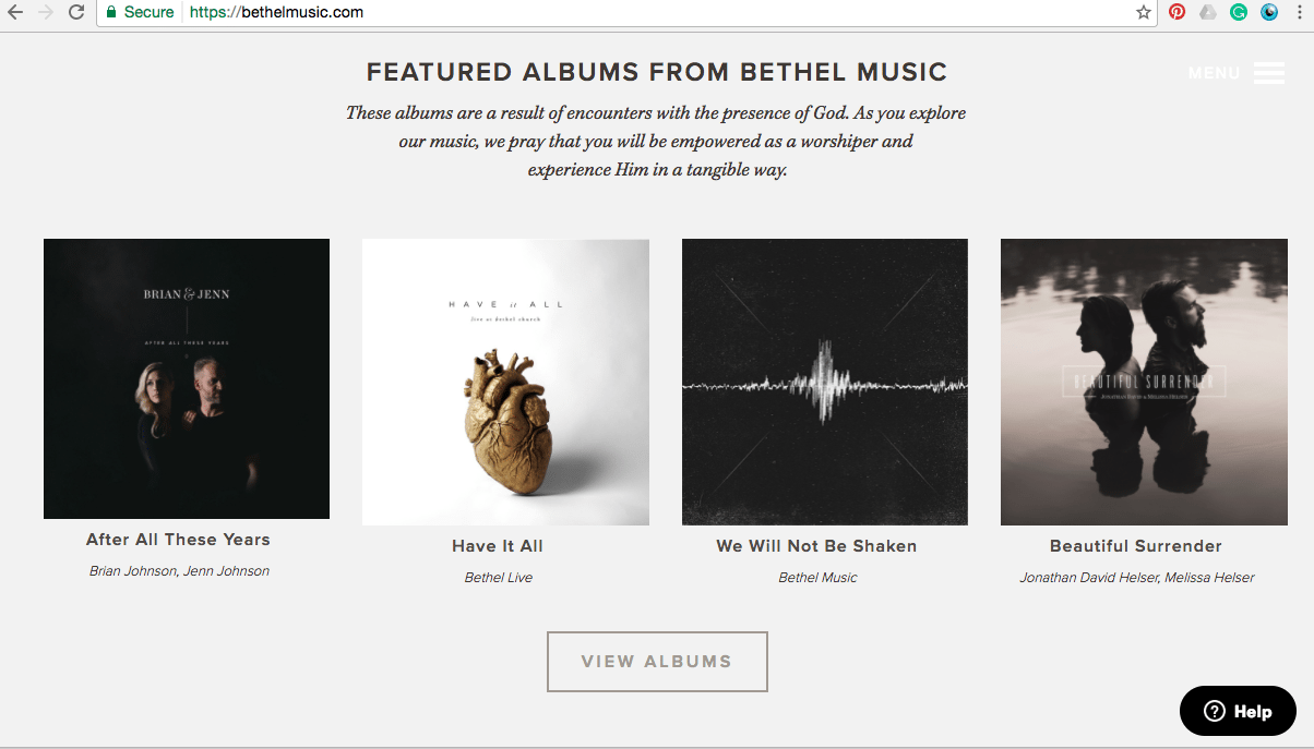
Throughout the site, they have lots of imagery & you can look at all the album artwork at once. Some of the design are more somber than others, some have high use of color & some have high use of typography. They have clearly spent time thinking about:
- WHO THEIR AUDIENCE IS.
- WHAT IS THE MESSAGE ABOUT.
Those are 2 great questions you can ask yourself or your design person/team as you move forward.
WHAT NOW?
Here are some next steps:
- Canva: Check out Canva.com they’ve got great tutorials and easy tools for anyone to make great design. They even have suggestions of how to pair fonts and backgrounds.
- You probably have great artists/designers at your church. Ask them for advice. A pastor’s job is to be a shepherd the people (no offense, pastors), but that’s like asking me to go cure a sick person at the hospital, I wouldn’t know what to do so I’m not about to make something up. However, that means that you probably have talented people close to you, and you can empower them to use the talents that God gave them
- Take some steps. Now that we’ve shared these fun facts, it may be that you’re thinking “My church is behind! I have no idea where to begin.” That’s ok. Simple, pray for peace and ask for God to give you the steps, to provide Holy encounters where you can meet talented people, after all it’s His gospel you’re sharing, He won’t leave you out to dry.
- As always, we would love to partner with you to share your message, if you’re interested browse our site for our work or send us a quick message at: TalkToUs@epiclifecreative.com
Helga Sierra is a graphic designer & marketing consultant for Epic Life Creative based in Honduras. She’s starting a non-profit to empower kids of low-income neighborhoods through art, does photography and more. Follow her on Instagram right here!