How to Reflect Your Church’s Values in Its Website Design
In a world where first impressions are increasingly made online, it’s more important than ever for churches to have a well-designed website that accurately reflects their mission and values. A poorly designed website can communicate the wrong message about your church and turn away potential visitors, so it’s crucial to put your best foot forward.
Fortunately, creating a beautiful and effective church website doesn’t have to be difficult or expensive. By following a few simple principles, you can design a website that accurately reflects your church’s unique identity and makes a great first impression on everyone who visits it.
Here are a few tips for designing a church website that reflects your values:
1. Keep it simple. When it comes to church websites, less is more. You don’t need bells and whistles to get your point across; just focus on communicating the essentials clearly and concisely. Too much information can be overwhelming, so make sure every element on your site serves a specific purpose.
2. Make it visually appealing. First impressions are important, so take the time to make sure your site looks professional and polished. Choose colors and fonts that reflect your church’s personality, and use high-quality images that convey the right atmosphere.
3. Be intentional about your content. Every word on your website should be carefully chosen to reflect your church’s values and mission. Avoid using jargon or assumptions about what people already know; instead, make sure your content is accessible and easy to understand for everyone who visits your site.
4. Be welcoming. Your website should make everyone feel welcome, whether they’re long-time members or first-time visitors. Use language that is inclusive and affirming, and avoid anything that might make someone feel excluded or unwelcome.
5. Keep it up to date. One of the quickest ways to turn someone off from your church is to have a stale, outdated website. Make sure you’re regularly updating your content, adding new blog posts, uploading new photos, etc., so people know your site is active and relevant.
6.[ Provide opportunities for interaction.]Your website should be more than just an online brochure; it should give visitors a chance to interact with your church community in meaningful ways. Include features like online giving, forums, sign-ups for events or classes, etc., to encourage people to get involved.[/ provided]
Conclusion: By following these simple tips, you can design a church website that is reflective of your values and welcoming to everyone who visits it. A well-designed website is an important tool for churches in today’s world—so make sure yours is doing its job!
5 MORE Tips For Designing A Church Website That Reflects Your Values
Blog Introduction: In today’s hyper-connected world, having an online presence is essential for any business or organization—including churches. And while you might not think of your church as a business, per se, the truth is that in many ways it is. After all, you’re in the business of spreading the Gospel and attracting new members. So, just like any other business, your church needs a website that accurately reflects its values and mission.
Creating a church website can seem like a daunting task, but it doesn’t have to be. By following these five tips, you can create a beautiful and user-friendly site that accurately reflects your church’s values and mission.
1. Keep It Simple
When it comes to design, less is almost always more. That’s why one of the most important things to keep in mind when designing your church website is to keep it simple. Remember, you want your site to be easy to navigate and user-friendly. That means avoiding anything that might distract or confuse users, such as cluttered layouts, complex animations, or automations. Instead, opt for a clean and straightforward design that will make it easy for users to find what they’re looking for—whether that’s information about your church or directions to your next service.
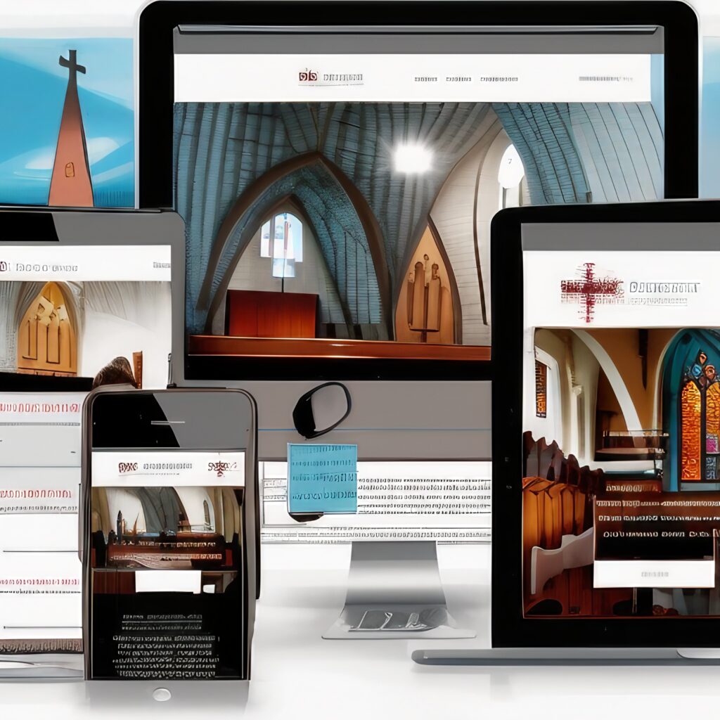
2. Use High-Quality Images
Another important tip for designing a church website that reflects your values is to use high-quality images. Remember, first impressions are everything—especially online. So, you want to make sure the images on your site give visitors a positive impression of your church. Avoid using stock photos or low-resolution images. Instead, opt for professional photos that accurately reflect the atmosphere of your church. If you don’t have professional photos on hand, consider hiring a photographer to take some for you.
3. Choose The Right Colors
The colors you use on yourchurch website can say a lot about your values—and you want to make sure they’re saying the right things about your church. When choosing colors for your site, avoid using more than three or four different colors. And steer clear of using colors that clash or are difficult to read. Instead, choose colors that complement each other and accurately reflect the feel of your church. For example, if your church is modern and trendy, you might want to use brighter colors like yellow or orange. If your church is more traditional, then classic colors like blue or gray might be more appropriate.
4. Make It Mobile-Friendly
In today’s world, it’s essential to make sure your site is mobile-friendly—meaning it can be easily viewed on any device, whether that’s a smartphone, tablet, laptop, or desktop computer. More than half of all web traffic now comes from mobile devices, so it’s important to make sure your site can be viewed on them without any issues. To do this, you’ll need to choose a responsive design template that automatically adjusts to fit any screen size. Additionally, be sure to test out your site on multiple devices before launch to ensure everything looks the way it should and there aren’t any issues with functionality.
5 . Include A Call-To-Action
Finally , be sure include a call-to action (CTA) on every page of your church website . A CTA is an element—usually text or an image —that encourages users to take a specific action , such as signing up for email updates , registering for an event ,or making a donation . Without a CTA , visitors to your site might not know what actions totake next . Including a CTA on every page ensures that every visitor knows exactly how they can get involved with your church .
By following these five tips , you can design a beautiful and user-friendly church website that accurately reflects your church ‘s values to attract new members and grow your congregation .Visit our blog for additional resources on how to market your church effectively online.