Below is notes from our class we taught at the Dave Ramsey Business Boutique. At the time, this information about best practices for churches, ministires and small bussiness standards and trends for web development in 2016 🙂 There is still some GREAT information on here that applies, and watch for our article coming one on 2020 web development trends!
Bringing Your Website To Life
IMAGERY
Text still is and will continue to be an incredibly incredibly important aspect of your website for so many reasons, but there is growing importance for high quality images. Think about your favorite sites right now, chances are they are already making the transition towards more brilliant imagery. Social media has played a huge role in this movement. Instagram and Facebook rule our free time (I know you never look at while working:) You are 39% more likely to interact with an image driven post than we are one that it is only text. We should follow the cues and incorporate bold graphics into our sites.

While you can’t just post an image to say everything, they must be paired appropriately on our sites as much as possible.
Microinteractions
Micro what? Microinteractions are literally Tiny-Actions that we ask people to take. Small actions that invite the visitor to your website to click and poke around. The more they click, the more likely they are to stay around longer. Sound odd to think about asking someone to click more than just the menu item, but we do it every day hundreds of times. Again, social media has trained us for this. We like and love and read more all day long. It’s more than making someone jump through hoops, it invites people to engage and stay engaged.
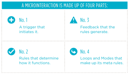
To download the rest of this incredible infographic on microinteractions from microinteractions.com
You’ve seen ’em, they may even get on your nerves – Long landing pages are here to stay, at least as far as we can see. Not to bring it up again, but this is another one that social media has pushed the design-hand forward on. We spend hours a day scrolling and scrolling and scrolling, so it has become a standard in web building. While it’s not the infinite scroll that social media is, website pages have become longer and longer.
This creates a great realestate to tell an entire story with your page, not just put out a few bits of information.
For a great example (and the project management system we love)
Colors
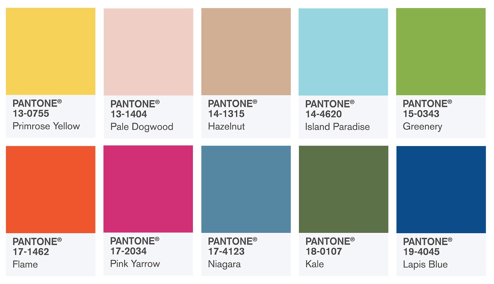
This one will be simple: Colors and styling of colors come in and out, the current web trend for colors is pushing for vibrant colors and accent pops that grab your attention.
If you want to get uber picky on the colors you choose, you can check out the 2017 Pantone color predictions!
People crave real people with real lives on the other side of the screen, direct chat does just that. Especially for smaller businesses or start-ups, this is a direct line to people interested in what you offer and who you are. This makes it easy for them to interact quickly and see if what you are offering is just-right for them.
We use it and love it! Check out our Hero Purechat.com
Mobile-First
When designing a site it’s so tempting to proof and build with the thought that everyone is going to view it from their laptop or computer. As a designer, this was a hard one to break since I work all day long looking at my big ol’ screen, but mobile phons have officially been named as the primary device used for browsing the web.
Mobile-first design is just that, designing by thinking about how it will be viewed on mobile, first. By starting with the smallest screen size your site will be viewed on, you begin to make style choices you might not have otherwise. After thinking mobile-first, then you keep moving on up to the largest ones.
Always keep in mind the end game, engaging with people. So if you want to engage people, you meet them where they are.. and that is most likely on their phone.
Responsive Design
Back in the day (and still a lot of design firms now) design one site for computers, another for tablets and another for phones. If you build with a responsive site builder, template or firm that designs that way – the site shifts elements around on the page so that the same site moves seamlessly from device to device, taking out the need for multiple versions of your site.
Have you ever noticed when you change the browser size on your computer how the elements on the site you were just on now look different? That’s responsive design. You can check out our site on your computer and move the browser window to see it in action if you’ve never noticed before!
[/et_pb_accordion_item][et_pb_accordion_item title=”Full Screen Sign-Up Modeles”]The old standard for signups have been popups, but do any of us really love them?
Modern and responsive design has given us some amazing options for communicating. Full screen areas do just like what they sound like they do. A website can recognize the screen size of the person who is viewing it’s page and fills the screen edge to edge.
Popups interrupt the flow of what your viewing, instead full screen images gently push content out of the way making it a simple part of your web-viewing experience and ads space to use persuasive text.
We use full screen image areas in multiple places on this page, Enjoy!
Parallax
One of my favorites! The literal definition is the effect whereby the position or direction of an object appears to differ when viewed from different positions.
Simply put, its when the background moves at a different pace or speed than items in the foreground. It’s beautiful in my option and invites visitors to interact with your site. The more we can engage with our audience, they more they’ll engage with us!
For a seriously beautiful design check out epicurrence.com
The Do’s & The Dont’s
DO:
Put Your Number & Email Everywhere
Publish High Quality Content
Use Easy Navigation
Use Calls-to-action
Establish Credibility
Use Strong Images
Organize Thoughtfully
Be Universal
Choose The Right Colors
Obey The First Glance Rule
DONT:
only put your contact information on your contact page
publish content just to stay on track
make the menu over complicated
leave the visitor with no action to take
trust that people will just like you
grab images from google image search
haphazardly place content wherever it fits
use insider language
use too many colors, or poor color choices
take too long to state your objective
Let’s talk about what you want to accomplish!
Knowing what you want to accomplish on your site help’s you or the design team know what steps to take in designing your site. Most functionalities can be covered within WordPress (our favorite content management system), but others can be easier to use out the gate if you’re building it on your own.
For instance, SquareSpace does make Beautiful sites, and most people can figure out how to work their way around building in square space. However, SquareSpace does have limitations. For instance, if you’re wanting to have a membership driven site, SquareSpace does not offer that functionality – but WordPress does.
Knowing from the start what features you want to have on your site will help you or your design team determine what website builder to go with!
Once you know why you want or need a website then you can begin the process of building, designing, or redesigning your site.
Who is your target demographic?
The more specific you are with who you are talking to, the easier it will be to reach them. You’re going to want to say EVERYONE, but unfortunately you can’t. Technically you can, but if you try to be open to everyone, you actually lose almost everyone.
If you can narrow down your scope to the people who are Most Likely to buy into what you are offering, the fringe of people will follow along as well!
Based on what you want it to do and who you want to reach, what do you want your site’s “voice” to be?
There is another session about using narrative, which is a great technique. People connect with stories. Your website’s story should be one that effectively communicates your message without compromising what it was built to do.
For instance if you are selling something, your site’s primary purpose is to sell that product or service. If your site spends too much time telling your story and doesn’t get to the sales pitch, you’ve just talked yourself out of a sale. If it doesn’t have any story, people will wonder why they should buy from you vs any other faceless website online.
Commercials use this principle all the time. A friend of mine makes commercials for car companies and has worked for Honda, Nissan, and Acura. He told me that they will often use the background to communicate the story while the foreground is giving the actual sales pitch. I happen to interested in cycling and started noticing that in so many commercials there is a bicycle in the background. Sometimes (because these are car commercials), they are in garages, but very often the bicycle can be found leaning against the wall inside the house. There is even one where a mother and daughter are doing school work together and an adult male bicycle is leaning against the wall in the dining room.
I asked my friend why there were so many bikes in commercials and he said it is because they are “aspirational” objects. In addition to bikes there are often musical instruments laying around, which is common behavior here in Nashville but elsewhere musical instruments are new year’s resolutions not common wall art. They are telling the story of a family that is living the kind of life that you want to live, they share your dreams of learning to play the violin and living an active lifestyle. If you just buy their Audi, you might finally start commuting by bike (Ok that one might be a bit of a mixed message).
This is speaking from the designer side of my brain. When I build something, I want people to feel a certain emotion. The same is true with websites! We want those who visit our site to get who we are. This is accomplished through text, images, color choices and layout.
News sites are heavy sites with lots of stories popping up everywhere, but we expect it because we’re looking to gain lots of information. If you were going to a blog about bettering your life, if should feel more simple and peaceful. The blog would feel overwhelming if it were set up the same way as a news site.
Take time to think about people who are doing similar things to what you want to do and are successful at it. What feelings do you have as you visit their site? If they are successful, you should consider following their lead with the feeling of their site.
To name a few feelings:
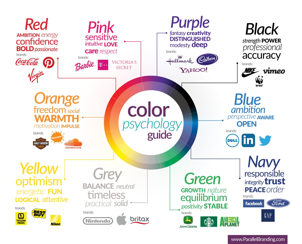
Color Psychology Infographic Designed By Parallel Branding parallelbranding.com
Your domain name is the address that visitors will type in to go to your site. Technically your address is a bunch of numbers, your domain is the easy to remember “name” that is attached to that number.
Often, because people have been buying up domains for years, it’s hard to purchase the Exact domain name to match our company. It’s important to think through what alternative domain names could be for your site.
For example, if your name was Live & Love Lifestyle Blog, liveandlovelifestyleblog.com is available but way too long. We want to think of the shortest name possibly thats easy to remember. Lifeandlove.com is taken. LiveandloveLB.com is available, but I think we can do better. Thanks to new domain extensions like thewell.coffee or liveepic.life, theres a new world of possibilities. AND liveandlove.blog is available! It’s concise and says what it is.
Give your name a whirl, my go-to for figuring out the right domain name is godaddy.com.
(side note, I’m a domain hoarder! we own over 25 domains that tie to our location, our name or our purpose. It doesn’t necessarily help people find us more easily… but it’s called hoarding for a reason and I just enjoy having them;)
You can buy your domain name at a lot of places online. Typically they all cost about the same, it will be a yearly cost, and typically .com is preferred but not necessary. Try if possible to get a .com domain extension. There really isn’t a technically better domain extension and they all work equally well, however people tend to have the perception that .com is more professional and are more likely to remember .com instead of .org or .net or something along those lines.
There are a lot of places to buy your domain name which is a yearly fee. Namecheap, godaddy, Google Domains are all popular places. It doesn’t really make a difference where you buy them although I will say that GoDaddy has a tendency to try to upsell you on things you don’t really need.
A host is where your website is physically located. It is a computer in a room full of computers in a building full of computers. Every website is hosted somewhere.
This confused me when I first got started, so i’ll just state it if anyone else is confused. Purchasing hosting and purchasing a domain name are two different things. The HOST is like the actual place where your house is built. The DOMAIN would be if you had to also purchase the rights to use a street address number.
If you choose a service like Squarespace, Shopify, or Wix, they typically include hosting in their plans and you never have to worry about finding a host. If you go the WordPress, Magento, or more advanced route, then you will need to get hosting which is a monthly fee.
Shared hosting is the cheapest. Your website is hosted on a computer along with other websites. This is most affordable and slowest. If you don’t expect very much traffic or visitors, this can be a cost effective route to go. Just be aware that if one of the other sites on the same host suddenly gets popular, then it can slow down your site as well.
WordPress hosting, is just that, hosting that is optimized for WordPress. Typically this is the 2nd cheapest option (though sometimes it can be pricier). Because wordpress is so popular, the server computer and database have been designed from the ground up to get the most out of wordpress. Most hosting companies now offer WordPress hosting though not all. Some only offer WordPress hosting.
VPS or virtual private server is where the server has been partitioned and acts as though you have a server all to yourself instead of being shared hosting. This is more expensive that regular shared hosting, but faster, more secure, and usually only a little bit pricier. If you are expecting a good amount of traffic this might be the way to go. And usually once you decide on a host, you can start off at shared and then upgrade later on.
Dedicated server. This is where you get a whole server or servers all to yourself. It is really only necessary if you have an enterprise website. For virtually all small to medium sized businesses this is overkill and prohibitively expensive.
If you decide that you need a host there are many options including, bluehost, dreamhost, Flywheel, and more.
For our SEO section, please click HERE to download our Hello SEO free E-book!
Hello SEO + Epic Life Creative {2018}
Talk To Us!